When it comes to graphic design, colour is life! Colour is like a language and a well thought-out colour palette has the power to speak volumes without saying a word. It can generate a mood, create ambience and even evoke emotions. Graphic designers understand the power of colour, and they understand that it must be handled with care. This is where colour theory comes in. Colour theory is a conceptual toolkit that enables designers to administer and manipulate colour to their advantage. Think of this blog as Colour Theory 101. We will walk you through the fundamentals of colour wheels and colour schemes and explain their significance in graphic design.
Understanding the colour wheel
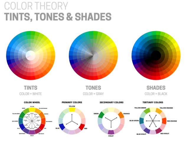
All colour theory begins with the colour wheel. In 1666, Sir Isaac Newton invented the first colour wheel to demonstrate the relationship between colours. A basic colour wheel has 12 colours:
Primary colours: The 3 primary colours are red, blue, and yellow. These are the foundation for all other colours.
Secondary colours: Secondary colours are made from mixing two primary colours. They are green, orange, and purple.
Tertiary colours: The word tertiary means ‘of the third order’. There are 6 tertiary colours that are created by mixing a primary colour with a nearby secondary colour creating red-orange, yellow-orange, yellow-green, blue-green, blue-purple, and red-purple.
Some more sophisticated colour wheels also have inside points and circles that depict additional colour mixes. These visualisations can assist designers in understanding how colours blend and impact one another, allowing for a more advanced knowledge of colour interaction. Interior points are frequently used to indicate hues, tints, and tones:
- When creating a shade, black is mixed with a hue making it darker.
- A tint is created by adding white to a colour thus making it lighter.
- To make a hue less vivid or more subtle, grey (both black and white) is added.
While these colour theory aspects may appear complex, they will provide more control and precision in your work. Knowing the extended colour wheel and how different colour mixes are achieved will allow you to further develop your designs and obtain a more exact colour harmony. Learning colour theory is a journey and as you understand more and experiment with combinations and tones, your designs will become more compelling and impactful. Whether you're dealing with a simple 12-hue colour wheel or the intricacies of a 24-hue colour wheel, your understanding of colour theory will become a core tool in your graphic design toolbox.
Colour temperature and its influence
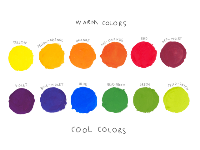
Colour temperature refers to where a colour falls on the temperature spectrum between warm and cool. It is the feeling a colour or tint will evoke. Warm colours are those found on the red side of the colour wheel. They incorporate bold and powerful colours such as red, orange, and yellow.
There are strict distinctions between warm and cool colours but there can be some nuanced colour temperature connections within the warm and cool groups. For example, one shade of red may be regarded as cooler than another, more intense shade of red. In contrast, one shade of blue may be said to be warm when compared to another, deeper blue.
Colour temperatures also have psychological and perceptual effects on humans where a colour's apparent warmth or coldness might influence our emotions and feelings about a design. Warm colours may elicit sentiments of optimism and enthusiasm, whereas cool colours may elicit feelings of tranquillity and calm.
Colour temperatures can also influence how we perceive spatial relationships within a design. Warm colours tend to be more prominent and stand out more, making objects appear closer or larger. Cool colours, on the other hand, recede, making them ideal for conveying depth or distance.
Using colour temperature correctly in your design work will help you produce more dynamic, engaging graphics. By understanding how to combine warm and cold colours how to to use them to affect perception, you can create depth, provoke emotions and guide the viewer's eye through your design

Colour harmony in graphic design
Colour harmony is the aesthetic balance of colours that complement one another. There are numerous colour harmonies that are commonly used:
- Complementary colours: Those colours are immediately opposite each other on the colour wheel. Examples include red and green or blue and orange.
- Analogous colours: These are colours that are near to each other on the colour wheel, such as red, red-orange, and orange.
- Triadic colours: This is a scheme made up of colours, such as red, blue, and yellow, that are evenly placed across the colour wheel.
- Split-Complementary colours: This is achieved with one base colour plus two complementary colours.
- Tetradic (Double Complementary): This is the combination of two sets of complementary colours (4 colours).
Graphic design colour schemes
Choosing an appropriate colour scheme is key to establishing a design's tone. Here are a few colour schemes that are often used in graphic design:
- Monochromatic colour schemes: employs a variety of tints, hues, and tones within the same colour.
- Analogous colour schemes: colours that are analogous are those that are adjacent on the colour wheel.
- Complementary colour schemes: colours from opposite sides of the colour wheel are combined to create a high-contrast, lively effect.
- Split-Complementary colour schemes: A complementary scheme variation with a base colour and two colours adjacent to its complement.
- Triadic colour schemes: Makes use of three hues that are evenly placed around the colour wheel to create a balanced, yet vivid look.
Practical Tips
- When selecting colours, always keep your message and the audience at the forefront of your decisions.
- Less is more. It's often best to keep your scheme to a max 2-3 main colours.
- Always test your colour choices on different displays and if possible, in print.
- To build a strong brand identity, keep your colour choices constant.
Colour theory may initially feel a little overwhelming, but it is in fact a powerful weapon in the hands of designers who understand it. You will make more informed design decisions and build effective, captivating visual storytelling by learning about colour wheels, colour schemes, and the psychological effects of colour. A thorough understanding of colour theory can boost your work whether you're designing a logo, a website, or a marketing brochure. Continue to play with colour - the options are limitless!
Are you ready to dive deeper into colour theory? Check out our extensive graphic design courses, which cover everything from colour theory to typography to layout design. If you can master these talents, you'll be well on your way to becoming an outstanding graphic designer.